Today we launch the completely re-designed and industry-leading fund detail page with investor-friendly features to quickly highlight all that you need to know about making an investing decision.
Fund selection is tricky – there is so much data on Mutual Funds and different investors pay attention to different variables for making fund choices. We have focused on creating an intuitive funds page to display all the important data in an easy to consume format while retaining the simplicity of our UI. We have also focused squarely on what’s most important – comparison to index, category and peers, to highlight the performance of a fund versus others.
The information is divided into four tabs – Performance, Comparision, Holdings and Others to make it easy to process.
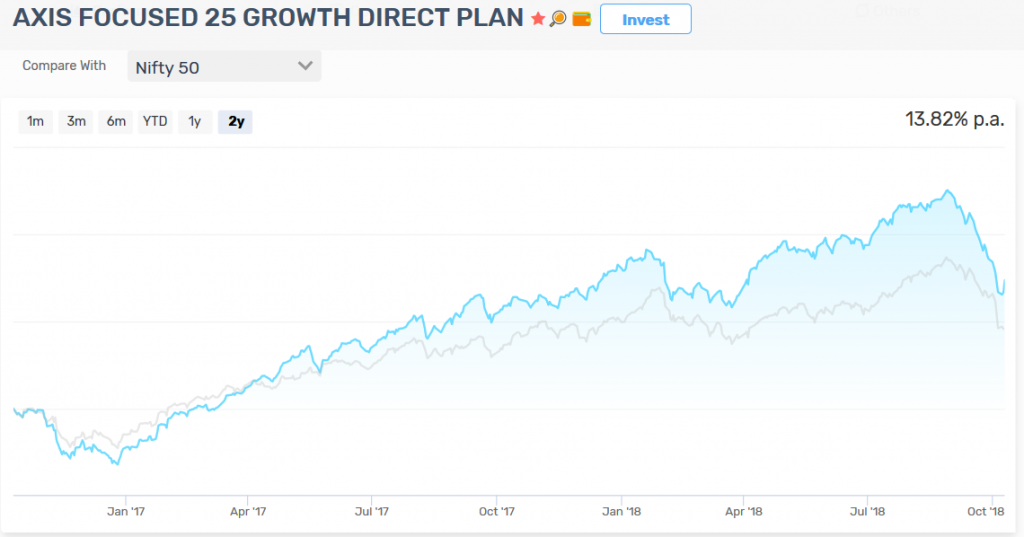
Besides prominently displaying AUM and TER, we show Index comparison for equity schemes to visually identify periods of outperformance. You can choose from 4 different indices to visually see the comparison –
Nifty 50 | Nifty Next 50 | Nifty MidCap 100 | Nifty SmallCap 100
There are other simple clues as well. If the selected period return is positive the NAV chart will be blue else it will be red. The idea is to make all the information available in a few glances.
We show the Category Average from CRISIL to give a comparison of the selected fund vs its category.
On the Comparision tab, we show how the fund compares with 4 schemes in the same category. You can add more funds to the compare table by using the [Add Fund] button and compare funds you are interested in investing. You can also remove existing funds in the comparison table by clicking [-] button next to the scheme name. The comparison table is sortable on the shown variables and allows for quick investment into any scheme added to the table.
The holding tab shows the top 10 holdings and the top 5 industry exposure for the scheme. A quick way to see for concentration risk. The rest of the scheme-specific information is shown in the “Other” tab – including fund manager, scheme objective, exit load if any etc.
This is how we had envisioned the ideal fund’s page to be – all the information you need, intuitively categorized, to make an informed choice. We are happy to bring it to you today to make fund selection easy and intuitive.
Take it for a spin and let us know your thoughts.
Start investing through a platform that brings goal planning and investing to your fingertips. Visit kuvera.in to discover Direct Plans and start investing today.
#MutualFundSahiHai, #KuveraSabseSahiHai!

