As a beginner, understanding the stock chart is a key step to becoming a successful investor. Stock market charts look much more chaotic or complicated at first glance. But don’t give up; we will help you get a grip on stock market chart analysis.
Finding a suitable investment for your portfolio is possible only through stock chart analysis. A deep understanding of stock chart analysis helps to make wise investment decisions.
You will have multiple questions in your head: what is a share market chart? Types of share market charts? And how to read stock charts? This article will discuss and resolve all your queries.
What is a Share Market Chart?
Everything related to the stock market might confuse you if you have no idea about stock chart analysis. Before we get into the advanced aspect of the share market chart, it’s essential to understand what a share market chart is?

A share market chart is a graphical representation of the changes in the stock price or trading volumes over time. This information can be present in many ways. The share market chart has a distinct formation that develops a trading signal and an insight into future price movements in a graph.
Like any other chart, the stock market chart has two axes; the horizontal axis represents the historical time period, and the vertical axis presents the stock price or the trading volume corresponding to each period.
There are many types of stock market charts. Here is a look at the types of share market charts.
Types of Share Market Chart
To represent the data comprehensively, the technical analysts use different charts. Here we are discussing five different types of share market charts.
-
Daily Bar Chart
Traders are using daily bar charts to get various important information about stocks, such as:
- Opening price
- Closing Price
- The highest price of the day
- The lowest price of the day
In the daily bar chart, the open, close, high, and lower prices of the stocks are represented in a bar. This information is plotted as a series of prices over a specific time. The bar charts are often called OHLC charts; it is the short form of open-high-low-close charts. A bar chart helps traders understand the critical stock market details effortlessly. A bar chart is a set of 4 prices for a given day or a given period. It is connected by a bar precisely; it is called a price bar.
-
Line Chart
A most common type of chart tracks the closing prices of the stock of a specific period. A dot denotes the closing point, and all the dots are connected by a line to make a graphical representation.
Compared to other stock market charts and stock chart analysis, a line chart is simple and easy to understand. It helps the traders find the trends in the price. However, it tracks closing prices, but it cannot ensure enough information on intraday price movements.
-
Candlestick Charts
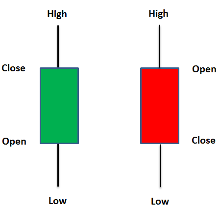
The candlestick chart demonstrates the price-related data in a different format. The graph is divided into two parts, and each part is represented by one single line. The thin line represents the price range from high to low, and the real body presents the wider area that allows computing the difference between closing and opening price.
Candlestick charts are a crucial tool for detecting and predicting marketing trends and are beneficial for interpreting the day-to-day sentiments of the market. Please keep in mind that the candlestick chart is not a tool that gives information on the open and closing price but only the relationship between these two.
-
Point and Figure Chart
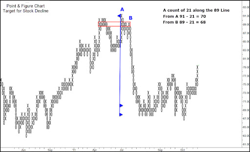
This technical chart is the oldest one among the stock market charts. The point and figure chart were developed to eliminate the unwanted noise in the market. This graphical representation demonstrates the price movement for stocks, bonds, and commodities, without considering the passage of time. Point and figure chart provides various trade and trade signals relative to traditional candlestick or bar charts.
Things To Keep In Mind While Learning How To Read A Stock Chart
Now, you must know stock charts and stock market graph analysis. There are multiple things you need to keep in mind while analysing the stocks. Here are a few key points to look at while learning to read a stock chart.
-
Identify the Trend Line
A blue line can be seen in the chart; it’s either going up or down. The first thing to understand is that stocks will take huge dives, and at the same time, they take huge climbs. Do not take such high-level changes into account; you can take this trend line to get a mere idea of the current stock market scenario. The trend line is a first glance to note the trend at the moment.
-
Check for Lines of Support and Resistance
You cannot overlook the line of support and resistance. These are considered the levels at which the stocks stay over a period. A level of support is the price that is unlikely to drop below; simultaneously, a level of resistance is considered the price unlikely to go above.
You can assume these two lines as bumpers at a bowling alley to make this more simple. When someone is bowling, the ball bounces back and forth between these high barriers. Here, the stock price is doing the same thing with the support and resistance lines.
A Stop-loss order is the significant benefit of support and resistance that the day traders can avail to avoid heavy loss. It supports the traders by stopping losses when they make a wrong decision, or the trend goes against them.
A Stop-loss order is placed with a broker to buy or sell a security when it reaches a particular price. It is specifically designed to limit a trader’s loss on a position in a security. When the stock falls below the stock price, the order turns out to be the market order, and it directs at the next available price. For instance, a trader bought a stock and placed a stop-loss order 10% lower than the purchase price. When the stock drops, the stop-loss orders will activate, and the stock will be sold as a market order.
-
Track When the Dividends and Stock Splits Occur
If you own the stock, you must track when the dividends and stock split occur. A dividend is when the company decides to give a share of its earnings back to the shareholders. It doesn’t mean all the companies will issue the dividends; the decision is solely up to the company. Companies focusing more on the growth will reinvest this money other than giving back to the investors.
-
Analysing the Historical Trade Volume
You can find small and verticle lines at the bottom of the share market chart. These are recognized as the trend of the volume at which the stock is traded. Volumes are significant; however, this is not the only parameter to consider while thinking about stocks. When the volume of stock increases, it can also make an instantaneous shift in the price of stocks.
Most Essential Stock Chart Patterns
Understanding the stock chart pattern is as important as understanding the stock market chart. Here is a quick look at the essential stock chart patterns and how to read those.
-
Ascending Triangle
An ascending triangle is a bullish formation. It usually forms during the uptrend as a continuation pattern. The distinct shape of ascending triangle has given a different name – the right-angle-triangle. Here, two or more rising lines form an ascending trend line that connects to the horizontal line as its rises.
Being said, the ascending triangle is a continuation pattern. When the breakout from the triangle takes place, traders tend to buy or sell the asset aggressively depending on the direction the price broke out. Since the ascending triangle is a bullish pattern, paying close attention to the supporting ascension line is essential. This indicates that bears are eventually exiting the market. Buyers are then competent to push security prices after the resistance level is denoted by the flat top line of the triangle.
-
Descending triangle
The descending triangle represents a bearish market downtrend. Here, the support line is horizontal, and the resistance line is descending. These signify the probability of a downward breakout. The descending triangle is a popular pattern since it shows that the demand for an asset, derivative, or commodity is diluting. When the price breaks below the lower support, it is a sign that the downside momentum is likely to remain the same or become more robust. The technical traders can avail more opportunities to make remarkable profits over a brief time by analyzing the descending triangle.
-
Symmetrical Triangle
In the case of the symmetrical triangle, the two trend lines begin to meet, which denotes a breakout in either direction. The support line is drawn with an upward trend, and the resistance line is drawn with a downward trend. However, the breakout can occur in either direction; it frequently follows the general trend of the market.
-
Head and Shoulder Pattern
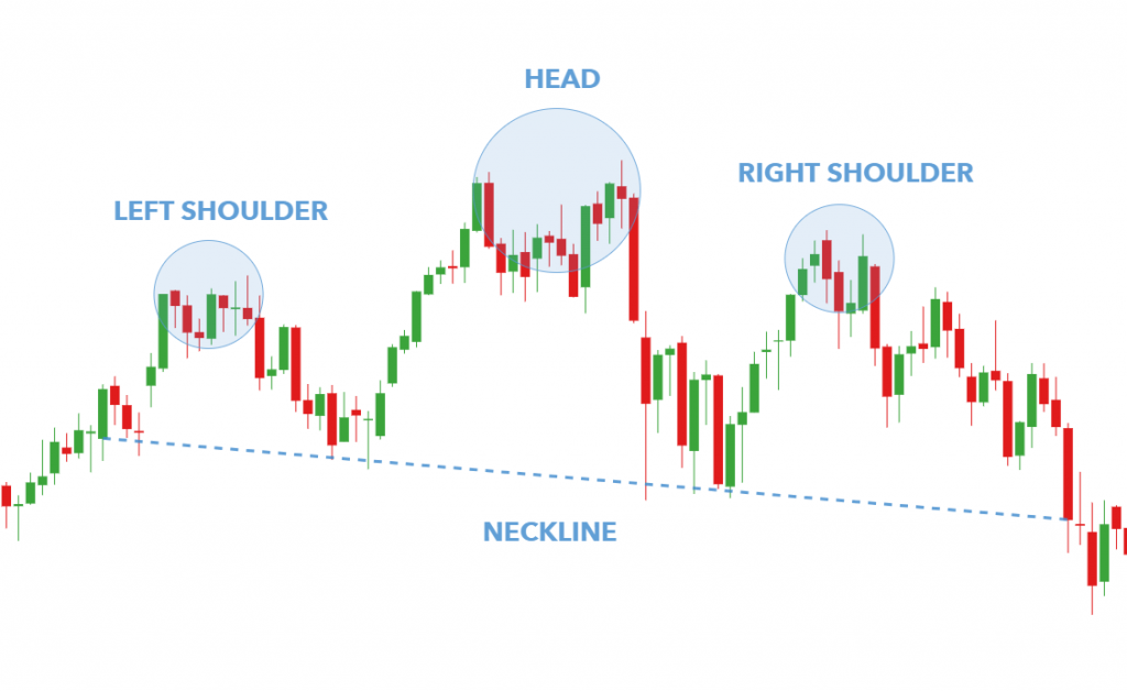
The head and shoulder chart appears as a baseline with three peaks, where the outside two are nearly similar in height. These are called shoulders. The middle one is higher than the others and called the head. The technical analysis describes this pattern as a specific chart formation that predicts a bullish-to-bearish trend reversal.
The head and shoulder pattern is popular among investors. It helps investors determine price target estimates once the pattern ends itself and the neckline has crossed. A Head and shoulder pattern is an easy way for the traders to place the stop-loss orders. The stops are ideally placed above the top of the head-high price in the case of a peaking head and shoulder pattern. In the case of the inverse head and shoulders pattern, stocks are typically placed below the low price formed by the head pattern.
To estimate the price that can move after the neckline is broken, you must return to the pattern and measure the distance. Vertically, from the top of the head to the neckline. Afterward, subtract that same distance from the neckline in the opposite direction. Begin from the point where the prices first crossed the neckline as soon as the pattern has formed its second shoulder. For example, the distance between the neckline and the top of the head denotes $20 in the stock price; when the neckline has broken, the analysts will project the stocks to decline in price to $20 below the price of the neckline level. Even though this is an estimated value, many traders trust this number and go ahead with the belief that the prices are more likely to decline at least the given price.
How to Read Stock Market Chart Patterns – Important Things to Keep in Mind
As mentioned, stock market chart analysis is crucial for traders. It allows the traders to move wisely and invest in suitable plans. Here are a few things to keep in mind while analysing a stock market chart:
-
Choose a Time
It can be done daily, weekly, monthly, or yearly. You can choose the view based on where you are accessing the chart. A broader picture ensures a broader perspective; likewise, looking at different timescales helps you get a broader perspective of the stock and longer and shorter-term trends.
-
Mark the Summary Key
You should check for the summary key since it will ensure you the critical information from the chart in numerical values. These numerical values are easy to read. This summary provides a quick overview of the latest price, the average price moving, and the volume traded.
-
Price Track
The stock market charts are divided into upper and smaller lower, leading to the prices. The upper section tracks the changes in the stock price over the period. The prices are mentioned in different colors. For example, if the stock closed on a particular day, the marker can be black, whereas the price of the stock can be marked in red.
-
Look at the Volume Traded
At the bottom of the chart, you can find a section consisting of the information on the volume of stock traded. This information helps you determine when there is specific momentum, positive or negative, in the stock market with distinct color code bars.
-
Track the Moving Averages
It is a calculation of the average stock price of a period. This value is constantly adjusted according to the time, and it is a vital tool in stock analysis. This information is typically indicated in charts by lines cutting across the chart. It can help the traders to identify the trend pattern; however, there may be some lag since they refer to the previous or past prices.
FAQ’s
-
What is a stock market chart?
The stock market chart is a graphical representation of a stock’s price and volume movements over a specific time.
-
What are the different types of stock market charts?
The different stock market charts are head and shoulder, daily bar chart, candlestick chart, and line chart.
-
How does reading a stock market charts help me in investing?
The stock market chart allows the investor to understand the current trends, price, and volume of a stock in the market; it helps the investor make wise decisions.
-
How do stock market charts patterns work?
The stock chart pattern represents the market’s supply and demand. The trends and needs in the market cause the chart to move in a particular way and form a pattern. The chart pattern helps the traders to understand the market and invest accordingly.
Interested in how we think about the markets?
Read more: Zen And The Art Of Investing
Watch/hear on YouTube:
Start investing through a platform that brings goal planning and investing to your fingertips. Visit kuvera.in to discover Direct Plans and Fixed Deposits and start investing today.
#MutualFundSahiHai #KuveraSabseSahiHai!