Investments in stock markets require in-depth knowledge and understanding of the functioning of the markets. Accordingly, traders use several tools to improve their trading prospects. One such tool is a candlestick chart that tracks the movements of stock prices over some time. Traders use this data for analysis and fulfilling their trading goals.
This popular tool has its origins in the 16th century in Japan, where a man named Homma developed a chart to show the relationship between the price and supply/demand of rice. This chart was modified over the years, and we know this as a candlestick chart.
Continue reading to learn more about how you can use candlestick charts to make the most of your stock market trading!

What Are Candlestick Charts?
Candlestick charts are technical tools that stock traders primarily use. It is a popular trading tool that is easy to read and understand.
These charts exhibit patterns in the stock prices and their movement. Traders use these patterns to predict the future price directions of the stocks and take the correct position in the markets. You can also amalgamate two or more charts to get a comprehensive trading pattern of a stock. A candlestick chart shows four major price points: markets open, markets close, and high and low price points over time.
Composition of Candlestick Charts
You can understand candlestick chart patterns by looking at their components. The composition of candlestick charts is given below:
- A candlestick consists of a rectangular part which is called a real body. Depending on the market conditions it is either colored red/black or green/white. It exhibits the price movement or range between the opening and closing of the markets.
- Thin lines extend, and they are known as wicks or shadows.
- You will see that candlesticks are red or black when the closing price of a stock is lower than its opening price.
- When the closing price of stocks is higher than its opening price, you will see a green or white candlestick.
- Wicks represent highs and lows in stock prices. An upper shadow or wick indicates a day’s high, whereas lower shadows represent a day’s low.
How to Read Candlestick Charts?
The four major thrust areas of candlestick charts are high, low, opening point, and closing points of the securities within a period. You can select the time frame in these charts, and indicators will be shown as per your preference.
For example, if you have chosen one week as the time frame, then candlesticks will show the stock indicators for one week only, and after the end of every week, a new candlestick will replace the existing one. With this, a trader can actively monitor price movements.
There are a few assumptions that one must keep in mind while dealing with these charts:
- Whenever a candlestick is green in color, it represents strength. At the same time, a red or bearish candlestick shows weakness in the securities.
- A candlestick pattern forms based on specific criteria. However, one must also consider minor variations in these patterns according to market conditions.
- Traders must make their decisions based on previous trends. For example, if they are looking for a bearish trend reversal, the previous pattern must be bullish.
- Similarly, when looking for a bullish trend reversal, the prior situation must have been bearish.
Analysis of Candlestick Chart
Traders must not analyze the candlestick chart in isolation. Observing past trends and patterns in previous charts is imperative for studying the present charts. Individuals must observe the changes occurring in the price of stocks over time. The shape and form of these charts exhibit these changes.
Traders can analyze whether the body of these charts has become larger or smaller over time. A larger body indicates momentum in the stock, whereas a smaller body of the candles shows that the growth outlook of the particular stock is not promising.
Individuals can also analyze what has happened to the wicks or shadows, whether they have grown taller or shorter over a time frame. Markets tend to be bullish when one sees long green candles, and markets are bearish when traders see a long red candlestick.
You can also see a candlestick in the shape of a spinning top. This happens when the body of the candlesticks is tiny, but the wicks are taller. This shape shows that stock prices have not shown a significant change between the opening and the closing prices, but the stock price has shown tremendous movement during the period. It mainly indicates the high volatility associated with that particular stock.
Traders must view the combination of high, lows, opening, and closing prices. Color, shapes, and shadows also play an important role in candlestick analysis.
Candlestick Chart Patterns
Candlesticks are an important tool for monitoring stock price movements and predicting future trends. Individuals can understand the relationship between demand and supply that controls the stock price. These charts form two types of patterns, namely bullish and bearish patterns.
First, we will go through and understand different candlestick patterns which are bullish:

-
Hammer pattern
This candle stick pattern has a short body and a very long lower shadow or wick. One can understand by looking at this candlestick that there was a selling pressure on that stock, and despite that, a strong buying urge helped raise the prices. If the candle’s body is green, the stock is on a bull run.

-
Inverse hammer pattern
This pattern is the reverse of a normal hammer pattern. It is made of a short body and a long upper wick. Investors may find this pattern at the downside of a falling trend. This pattern indicates that the stock faces buying pressure and then immediately faces selling pressure.

-
Bullish engulfing pattern
This pattern indicates a strong bullish sentiment in the markets. It is helping to raise the stock price even though the opening stock price was lower than the last day’s closing price. In the case of a bullish engulfing pattern candlestick, the first candle is always short red. A larger green candle engulfs it.
-
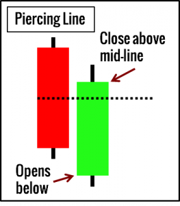
Piercing line pattern
A piercing line pattern consists of only two candles. The first one is a long red candle, and the next one is a long white candle. However, the closing price of a green or white candle must be more than half of the body of red/black candle. Therefore, traders must be ready for a strong buying pressure in relation to the stock.
-
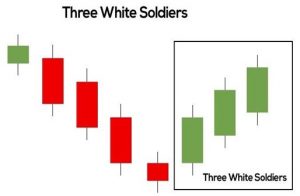
Three white soldiers’ pattern
Three white soldiers’ pattern consists of three green candles. These green candles open at a higher price than the last day’s closing price. It exhibits a decent bull run momentum in a particular stock. You can only see this pattern once the downturn in stock is over or the price consolidation phase is currently running.
Now we will discuss some bearish patterns formed by these candlestick charts:
-
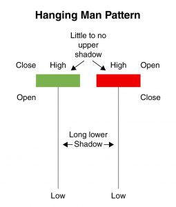
Hanging man pattern
The hanging man pattern is characterized by a short body and a long lower shadow of the candles. This signifies selling pressure in that particular stock during the time period. While analyzing these charts, traders can get a sense of things that bears are slowly taking control over the stock.
-
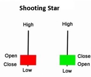
Shooting star pattern
One can see that this pattern has a longer upper wick and a short body. We can find this pattern at the top of a rising trend. It signifies that a stock opened at a higher price than the last day’s closing price. After this, the markets rallied and then crashed like a shooting star. This also means that there is selling pressure in the market.
-
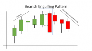
Bearish engulfing pattern
The bearish engulfing pattern consists of two candles, with the second one completely engulfing the first one. The first one is a shorter green candle which the larger red one completely overshadows. Traders can come to the conclusion that there is a slowdown in gaining traction in the stock price.
-
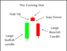
Evening star pattern
It comes in a three-candle pattern, with a short body sandwiched between a long red candle and a long green candle. The long and short candles do not overlap each other. However, it indicates a downward trend is setting in. This perception becomes more prominent when the third candle overpowers gains accruing from the first candle.

-
Three black crows pattern
It shows three consecutive red-colored candles having short wicks. It shows that stock prices have opened and closed at a lower point than that of the previous day. Traders can also sense that a bear run is on the horizon.
Final Word
Candlestick charts are an important tool that gives insight into the movement of stock prices. Traders must consider observing various charts and patterns as it allows them to predict the future trajectory of the stock.
Frequently Asked Questions
-
Which candlestick pattern is reliable?
Three black crows, the morning star, and two black gapings are a few patterns considered highly reliable by experts. All three have a very high accuracy rate, making them credible. These are some of the best candlestick patterns for traders to analyze a particular stock.
-
What are some factors to consider while identifying a candlestick?
The color of the candles, length of the body, size of upper and lower shadows as well as opening and closing prices are the things that traders must consider while identifying which candlestick chart is best for them.
-
What is a morning star pattern?
A morning star pattern consists of three candles with a short candle between a long red one and a long green one. The red candle indicates bearish sentiments, and the long green candle exhibits a transition to a strong bull run.
-
What are two black gapping patterns?
Two bearish candlesticks form this pattern. One can identify this pattern by looking at two consecutive bearish candles. Under this, the second candle opens below the lowest point of the first candle and closes near its opening price.
-
What is a Doji candle?
Doji candles are formed whenever the opening and closing price of a security is almost equal. You can see dojis as a cross, inverted cross, and plus sign. These candles are neutral and are an essential component of various other patterns.
Interested in how we think about the markets?
Read more: Zen And The Art Of Investing
Check out all our “Investor Education Originals” videos on Youtube and get smart about investing.
Start investing through a platform that brings goal planning and investing to your fingertips. Visit Kuvera.in to discover Direct Plans and Fixed Deposits and start investing today.
#MutualFundSahiHai #KuveraSabseSahiHai #PersonalFinance #InvestorEducation